
Scope: Branding
Duration: Eight weeks
Tools: Adobe Photoshop, Adobe Illustrator, Sketch, and Audience Feedback
Role:
Graphic designer
Upper Crust Bakery
Branding, Graphic design
Overview:
The Upper Crust Bakery has moved to a new location and is in need of a new logo. The company is well known for its bakery items (breads, muffins, etc.) as well as desserts. Upper Crust bakes its items fresh daily using local products.
When you walk into the Upper Crust, the smell of our fresh baked breads, muffins, and pastries fills the air. We have pride in our products and have passed down our recipes through the generations from our home country of France. When you are in the Upper Crust, we want you to feel the essence of Paris!

Rough Ideas:
While creating multiple designs I researched French bakeries to get some inspiration for the logo design. I wanted to go for a simple design that gets the message across to the audience to help convey the message of the company.
I gained some feedback on the design options, as shown above the client like the 3 the designs on the side. The client believes that these three designs meet their vision for the company branding. The client went with the 3rd design, because it best resembles a France bakery.

Rough Ideas:
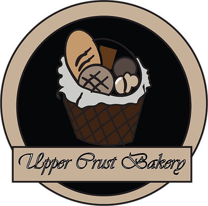
I used adobe illustrator to vector the sketch into the final design as shown on the left side. For the sketch I decided to take out the bottom box and instead have the the name of the company be wrapped around the logo. I thought that would be a great choice for the logo design.


The color choices for the logo:
On the left shows the multiple alternative colors for Upper Crust Bakery. One of the logo has color elements from the French flag. In addition, I did use grey for the blanket inside the basket. The reason for this inclusion of color is because, Upper Crust Bakery home is in France. I wanted to give the company a second color palette option to inform the audience of the companies origins.
I wanted to experiment with different color schemes and found that the orange color scheme came out the best compared to the other experiments.

The color palette I choose was varieties of browns for the bread. For the basket, and the logo area and the circle around the black circle are different shades of brown. As you can this color palette is the one that I choose for my client because of the way that the colors flowed as a unit. Also the logo would be appealing to both men and women age 21-65, which the client wanted.
Conclusion:
Upper Crust Bakery hired me to capture their message, and generate interest in the bakery when they move to a different area. While creating the logo for this company I wanted the logo to resemble a bakery from France. In addition, the type of basket I wanted to include was a French basket which individuals can store different types of breads in them.
The reason why I chose the Harringtion front , because its easier to read the companies name. Each of the stationary items are presented nicely. The business card I included the slogan “Experience the taste of France” to catch the reader’s attention.